Living Journalism

April 30, 2008

Wrapping Up – Blogging 3

Filed under: Flash journalism,Multimedia,Video — britr @ 11:04 am

Warning:  Cher Phillips and I spent a good 10 hours straight struggling with the semantics of Windows Movie Maker yesterday, so I’m willing this post to be legible, as we didn’t stop staring at the computer screen until 11:16 p.m.

Ten hours?  Yeah, even we couldn’t believe it.  The kicker of it all was, it wasn’t anything we did wrong.  Seriously.  The film was captured, created, cut and laid in all as it should be.  The editing and the narration and the fine-tuning went fine.  But as we were wrapping up yesterday, what we thought was screen resolution or settings turned out to be what we kept calling a “lavendar-crap” mess.  All of our film took on, about half way through editing, a blue-ish, purple-ish crappy-ish tinge.  Why?  We didn’t know, and it turned out that it definitely wasn’t screen settings.  It exported with the nasty tinge, too. 

Five hours later, we still didn’t know.  What we’re guessing now?  Codecs, the little jerks.  Apparently, the computer didn’t have enough of them.  The weird thing was, that only happened halfway through the editing process. Apparently, the codecs had reached their limit after a few hours of gospel music editing.

Eventually, we had to move to a different computer, where we could update the codecs without administrative approval (thank you University of Florida.)  We did, and the film no longer looked like plum puke.

But even that didn’t work out totally well.  It took us, I don’t know, another two hours to accumulate all the renditions and clips and cuts we’d made before, put them in the same, new folder, and search for each clip we made and replace the big red Xs in our edited timeline.  But we did it!

After that whole heartache, though, I’ve decided I need more problem-solving skills when it comes to video story-telling and editing.  Or skills that don’t take me 10 hours to excavate with a “Heck, we’ve got nothing left to lose.  Let’s just try this and see if it works.”  And that would probably mean I’d need a full-year class in this, so I had more time to play and experiment with the camera and the software.  I feel the more access I had to those, the more seemlessly editing would have gone, because I’d be more familiar and more proficient with it.  I realized this week, when we started editing, that we hadn’t had to do it in over a month.  I was rusty, needless to say.  (I realize this is my own fault, mostly, but in a perfect world..)

Practice makes perfect, as they say.

And with that, I will say that this class gave me a great love for (and a desire to make) documentaries.  To produce an hour-and-a-half film would be great and exciting.  However, I’d like more experience covering actual news this way, not necessarily an issue story, but a news story.  Not that they couldn’t be both.  But at times, I felt I was seeking the documentary story, and not the news story, which is hard for a journalist and a little confusing.  I like the challenge of telling a news story in a way, a visual way, that might not be expected, or in the normal reality of a standard news publication.

However, the ability to film and edit it is going to come in handy, however you slice it.  It’s another skill I can add to my set, so to speak.  And I think, if I can master several other elements of Flash, I’ll truly be able to make some interesting story packages in the end.
March 19, 2008

Blogging 2: Broken Trust – Sarasota Herald-Tribune

image_blogging2.jpg

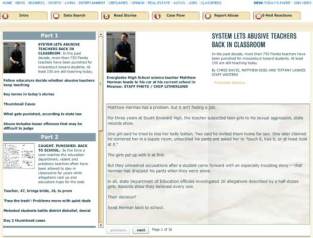
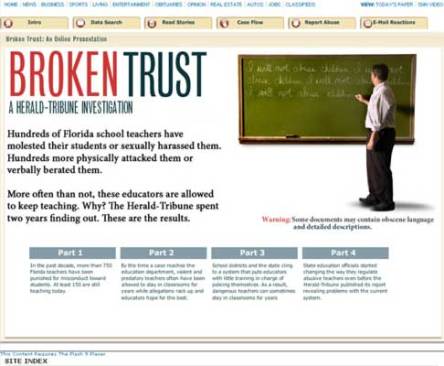
image_blogging2.jpgimage_blogging2.jpgI’ve spent the last two hours pouring over Broken Trust, a two-year, Flash journalism project created by the staff at theimage_blogging2.jpgimage_blogging2.jpg Sarasota Herald-Tribune, where they gathered information about abusive teachers who were still working in the Florida school system.  They delivered details on who they were, and what the stories of them and their victims were, as well as how the educational penalty system works, showing all the loopholes and misinformation circulating in judicial-educative circles.  Needless to say, I’m a tempted to move out-of-state before having children, so I don’t have to put them into the Florida school system.

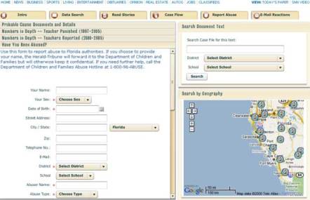
The writing was excellent, and the research was impeccable, leading to great parts of the Flash package.  The Tribune actually made it’s own database and search function, so people could see where child abuse and molestation offenders were located.  As they spent a great amount of time noting that the Department of Education didn’t actually track these offenders very well or notify neighborhoods and schools of their presence, this was a great, user-friendly feature.

image_blogging2_a.jpg

The stories were well-written and informative,  as well.  However, I don’t think they took full advantage of Flash’s abilities.  They simply worked like an un-illustrated book.  They did have pictures, but they were set above the active text, which read through like a notebook, complete with flipping pages.  I wanted the photos bigger and set within the active text.  You couldn’t even seem them while reading the story, and the images were related to the story being told.  I just didn’t want to have to scroll up and down to see them. 

image_blogging2_b.jpg

And I’m all for consistency, but it did seem to drag on and on with the same book-style design and action.  The main stories of the four parts of the project were OK, but then they had separate parts that explained terminology, the organization of the Department of Education and profiles on offenders, decision-makers and children.  They were mostly short, one to three pages each.   I wish they had been presented as graphics or in a different kind of Flash design instead of the same-old text style used for the main features.  It became monotonous after reading at least four different pieces for about 40 pages for all four separate sections.  That made at least 160 page turns on the same background and with the same text. 

The different tabs, which allowed the reader to report and seek out abusers, for instance, were much more interesting.  It drew the reader into the story and the topic.

Overall, the reporting and research, along with the terrible and riveting topic, made this project excellent.  The four parts, which appeared to be release on four consecutive days, told a very complete story.  I wished for more graphics, photos and images, but because of the sensitive nature of the topic, it can be forgiven, I suppose.

February 10, 2008

Blogging 1 Assignment – Videos from the Toronto Star

Filed under: Multimedia,Video — britr @ 10:38 pm

After viewing two videos from the Toronto Star, all I can say is whew!  Not to say that the paper’s videography isn’t good, but it’s definitely something I’m capable of doing, which, up until now, has been a slight concern of mine.

However, let’s take a peek at this videos.  First, there’s “Clean, safe and sterile at Toronto General.”  As a health reporter, I initially got excited about this video, but I’ve got mixed reviews after viewing it.  On a positive note, I thought the video gave very clear, meaningful and educational shots about the plant at the hospital that sterilizes hospital equipment and surgical tools.  The narrative matched the shots and informed the viewer of what they were viewing and what the purpose of what they were viewing was. 

However, the video didn’t tell a story.  It almost did, and it had the potential to, but it didn’t quite achieve the story telling element.  I wanted them to get close to a human.  The only human they interviewed was the director, and he didn’t really contribute to the story.  There was also very little footage of a human working equipment through the process, so there was very little footage of the tools working through the process.  I think that arc of story, from bloody surgical weapon to clean and sterile surgical weapon, would have helped the story-telling approach, but they didn’t take it.

I also watched “Storm hammers Toronto.”  This little slice of life about what happens when the greater Toronto area is hit by a big snowstorm included a lot of people’s voices and faces, and I liked that.  It gave a true feel of the what the city – made up of different kinds of people – was experiencing.  

However, it, also, didn’t tell a story.  It was a postman talking, a businessman talking, a pedestrian talking, etc.  They used a narrative to transition between citizens and explain the snow storm, but the images and the voices didn’t flow through an arc of story.  They hopped from voice to voice, stringing together video clips in no cohesive story pattern.

December 12, 2007

The end: Some thoughts

Filed under: graduate school,journalism training,Multimedia — britr @ 11:56 pm

We’ve reached the point in the semester where all the graduate student brain can do is muse, so muse I will.  We’re at the end of the semester, and 14 of us have succesfully completed Journalist’s Toolkit 1.  I can’t believe that 16 weeks later, I’ve got a whole new bag of tricks up my sleeve.  They aren’t necessarily polished and perfected tools, or tricks. I might not even call them tricks, or skills.  Perhaps, I have a new bag of abilities.  I do feel more competent as a journalist, however you put it.  More importantly, I feel more competent as a story teller.

In a multimedia world, words are almost incomplete as a medium to tell stories about people, places or issues.  However, at first,  I was loath to pick up a camera or a voice recorder.  How was I supposed to tell a good story if I couldn’t even hold the equipment right?

But what you hear can be powerful.  The voice has emotion — a huge element of story-telling — that you can’t replicate in the written word.  So I was forced to experience the microphone and the digital recorder.  And I fell in love.   Editing audio was suprisingly simple and suprisingly easy.  While I’m still daunted by journalists who sift through hours of audio, I at least feel like I’ve accomplished the small mountain that was audio gathering and editing in my professional life.  Technologically savvy world, here I come!

After one really bad experience in an Intro to Photojournalism class as an undergraduate, I was even more terrified of the next bump in our technological journey.   Photo shooting and editing.  To be honest, this ended up being my favorite part of the class.  I actually got a few select photos I love and am really proud of.  Don’t sign me up for photography yet, though.  I can only edit a photo or two.  But I can even frame a good shot, through the camera lense, without a blurry quality, courtesy of my shaking hands and trembling elbows.

What was most impressive for me was that I could use these photos and audio to tell a story, online.  I could load them into Soundslides and Web pages.  I am still a little shocked.  Sure, I could use some more coding practice.  Heck, I couldn’t actually write my own Web page if asked.  But I can work within that all-important content management system, and for that, I’m grateful.  I can even make all the material required for the site.  Not only the news and written word portions, but also the audio, the photos and the infographics.  Now that’s something to put on the resume.

But now, on to the skills that I’m still working on feeling grateful for.  This very blog is probably my least favorite multimedia skill.  I say that, knowing full well that blogs could arguably be the most important asset of multimedia story-telling today.  But here’s the deal. I’m just not so hot at it.  And it was, hands-down, the most impossible thing to keep up with.  

Blogging is not a casual hobby.  It takes a lot of work.  I’m going to have to approach it differently.  Perhaps set aside a certain amount of time a day to blog.  Or pay more attention to public feeds I’ve subscribed to.  True bloggers pay more attention to blogs than the front cover of the New York Times.

What an experience.  It’s pretty daunting the ground we covered.  It’s even more daunting when you realize what’s left to learn.  Journalist’s Toolkit 2 holds the promise of video, the promise of more precise editing skills, and the promise of spicier and more exquisite story-telling.  I might not ever reach the zenith of multimedia journalism, but I’m growing, and I’ve grown quite a bit over the last four months.

Final project: Hard-to-Reach Healthcare

Filed under: graduate school,journalism training,Multimedia — britr @ 7:36 pm

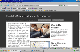
Screenshot

The final project is complete, and what an experience it was.  To be frank, I’m not sure exactly what just happened, other than the fact that it’s complete.

Apparently, I wasn’t supposed to see the coding in as much detail as I did.  And yet, using the file in Wordpad and working within the coding was the only way I managed to get the project done.  Sure, it was crazy.  But it worked, despite what everything else said.  When I got it open, it looked just like a standard newspaper’s content system, which I’ve been forced to work within before.  You just have to be very careful not to mess with anything, other than the text.  It takes a gentle and painstaking hand.  But WordPad and I were good friends by the end of it.

As for the reporting aspect, well, that wasn’t as hard as the technical stuff.  Turns out, rural healthcare is an issue right outside my door.  The drive to Grandin to find the clinic took under an hour.  When making the map, there were, for example, four clinics on the same stretch of a little county road, because the need for them was so great in the particular area.   The issue is also huge nationally.  And so, I was lucky enough to cover the national numbers on the introduction page, the state issue with a map, and a local story of one clinic with a Soundslides

Of course, I’d change a few things.  I want way more photos to work with.  I wish I had a chart, in retrospect, for stylistic reasons purely.  My map, while super-informative, isn’t so pleasing to the eye.  I also wish I had an opportunity to do more interviews and writing.  (I know, I know, this isn’t a writing class.  But I honestly think I could have written a nice counterpart to this.)  I also wish I had a way to use video here.  Thank goodness I’m taking Journalist’s Toolkit 2.

Basic Web Coding

Filed under: Blogging,Multimedia,online reporting — britr @ 7:10 pm

I missed one class all semester, and it was possibly the worst decision I made throughout the entire Journalist’s Toolkit experience. 

I missed the week that the class reviewed basic HTML/CSS and blog enhancements.    Coincidentally, of all my Web skills, I struggle the most with HTML and any blog-related skills that don’t involve typing in this box I’m currently typing in now.  Bummer.  So I’m left doing some self-learning, making up the lost ground I missed during absent Week 12, and, uh-oh, I’ve got to blog about it.

I’m so bad at building Web pages and blogs that even when Technorati writes the code for my own, individual widget for my own, individual blog, I can’t manage to make it work.  I actually struggled with the cut-and-paste the code technique.  For quite a while, I might add.  I put the code in the wrong place.  I altered the code without meaning to.  I got the Technorati icon to appear, but the link was dead.  And did I know how to fix any of it?  Nope. I end up getting so frustrated that I just start deleting things or cutting-and-pasting randomly.  Which, I know I know, is bad.  Very bad. 

However, I did manage to enhance my blog and work with the coding enough to get the widgets I wanted to appear almost perfectly (see right).  I’ve got an RSS feed.  I’ve got Technorati, although that one really put up a fight.  And I’ve got a Site Meter.  Kind of.  You see, the Site Meter works.  It’s a legitimate link, and it records and tracks my blog’s progress and popularity.  The icon also looks peachy-keen on my laptop.  But on my huge, archaic work computer, all I get is a little box, with an X, and Arial script reading “Site Meter.”  The link still works, but no pretty icon appears.  Coding problem?  I’m almost positive.  Do I know how to fix it?  Not on your life.

But all coding aside, the little hide-and-seek Site Meter icon stands for many more sources of pain in my ongoing, journalistic online experience. 

It blatantly and honestly records the fact that no one visits my blog.  When you’re popularity reads in the zillionth, you know you’re in trouble.  And you know you’re not doing what a true, journalistic blogger should.  The Site Meter makes the vague-but-troubling nature of my online experience all the more up-front and worrisome.  So what to do, what to do.  Like I said, bad day to have to miss class.

In short, I’m taking some inspiration from my Web and blog observations to write some New Year’s Resolutions for this blog, and how I can give it more pop, pizazz and higher Site Meter ratings.

1.  Read other blogs, and when I say read, I mean really read.  Sure.  I peek.  Sometimes, I skim, but I never truly absorb, and I need to if I want to understand how to make my blog better.

2. Comment on other blogs.  I need the ping-backs, and maybe if I’m generous with my words (which this class has proven are basically null-and-void, and sadly, my only true journalistic skill) I’ll get some curious visitors. 

 3.  Link to blogs that relate to what I’m talking about.  This would require me to take up Rule 1, as well.

4.  Put my blog out there.  I should put it in the bottom of my e-mails.  I should link to it in my online work.  I should link to it in online profiles.  I should work it into conversations wherever I can…

5. Give it some meat.  Journalists tell stories, and I really should do more of that here. I need to give the Web-readers something they want and need, not just synopsis of my learning experiences, which are required anyway.

So with less than three weeks to go till 2008, I’ve less than three weeks to get pumped up for a whole new blogging experience.  Cross your fingers for the good old Site Meter.  One day, it will read above zero.

November 29, 2007

Soundslides 3

Third one done!  Two things I noticed throughout this process:

One: I always want to do it again.  I’m never happy with my results, and I always think it could be better.

 And two:  Is there ever enough time?  Maybe it’s my life.  But between the unexpected and the expectations, bam! These things take forever. Even if I’m not happy with the end product, they take forever.  I guess I you have to go with what you’ve got when it comes down to deadline, though.

So here’s Soundslides 3.

FYI:  I’ll let you know more later about the slides and the reporting experience I had gathering them when I blog about some corresponding Web pages we’re working on to accompany our slides in my journalist’s multimedia class.

November 26, 2007

Why didn’t I think of that?

Filed under: journalism training,Multimedia,online reporting — britr @ 4:24 pm

In our last Journalism Toolkit 1 class meeting, we discussed in detail Adrian Holovaty, and his concept that online journalism shouldn’t be so story-centered, but should instead consist of graphics, layers, and most importantly, underlying databases, like his Chicago crime bank.

As a journalist, I cry, here! here! And here’s why:

As a reporter, we often want a stat, a number, an elicit, unarguable fact that can simplify a story and add credence to it’s subject. It helps prove credibility to viewers.

But when academic searches turn up nada, or when a journalist doesn’t have access to a database other than the U.S. Census records, he turns to other news articles, mostly news article about research, to find something, or someone, who has research on the topic in their story.

Many a time, I’ve looked to news archives to see what studies were used in stories with similar topics to mine. To copy their work? No way. But I do try to find the name and author of a study quoted in a similar news article. They study they used might also have a stat, a number, an elicit, unarguable fact that would apply to my story. And it’s a heck of a lot easier to find stats online or in the library if I know the name and/or the author of the research and statistics I’d like to use.

But the problem often continues to unfold: You find the name of the study, and you find a link to the researcher or institution.

But If the study was released in 2004, and you’re searching in 2007,  let’s say, often the site you were directed to no longer has the uploaded study, an easy series of links that lead you to the study, or even the study’s abstract to help you out. HealthGrades, a nonprofit that does research on health issues and gathers stats on the issue around the country, is one big offender that comes to mind.  You can never find past copies of their research and databases.

The only place you can find numbers from their studies is in news articles. And that doesn’t float another journalist’s boat, you could say. We need the study because we’re not about to copy another journalist’s work.

But, if we looked at journalism as a group effort, we might never have this problem. And Adrian gives us prime examples of how to fix this. Make databases, give complete sets of numbers on an issue, and put them on the Web. It’s a resource for journalists. And more importantly, it’s a resource for the public, which is really what media were meant to be.

A journalist who might have have to cover crime in Chicago would be thrilled to find hard numbers and facts from Adrian’s project. And a non-journalist member of society moving into Chicago might also be extremely grateful for that information as well. It’s much easier to interpret and judge the information when it’s presented in a database form.

However, the disheartening fact is, very few newspapers use this concept. Their Web sites, in light of these conditions, are horribly ineffective and unhelpful. Most of the time, their search engines and archive searches aren’t very capable. It seems like a long shot to have them implement underlying databases, complementing their news stories.

I wonder if journalists need to turn into hunter-gatherer researchers, of sorts. Do we need to find the numbers and create the statistics? Or do we just gather information from a credible source (e.g., the police, the county clerk, the state’s Department of Health) and put it into an easy-to-use database? Perhaps a mix of the two?  What kind of ethics break down the line between journalist and researcher?

I truly hope we can make changes with these online reporting ideas, but with short-changed newsroom budgets and staffs, I wonder how soon we can send out journalist hunter-gatherers, even when researchers don’t have the information we need.

November 8, 2007

Soundslides: Second attempt

I’ve made another Soundslides presentation, and I’m  little proud and sad, all at the same time.

My audio was much better than my first attempt.  I gathered tons of it, and the editing was much more natural. But my photos were almost painful.  None of what I planned to shoot even occurred.  In Soundslides about a bridal salon, I got no pictures of brides trying on dresses.

I went back twice, and the brides I planned to photograph cancelled their appointments or never showed.  I had no idea how much time it took to get amazing photographs.  Sigh.  I’m still working on that fine line between the ideal and what you end up with, despite the best of efforts.  Luckily, I’ll have one more chance to improve with another set of slides to end he semester.

October 25, 2007

Critique of another student’s Soundslides

Filed under: Multimedia,Photojournalism,Sound recording — britr @ 3:00 pm

Spread Out: Forming the UF experience with the Policy Debate Squad.
I think that this Soundslide tells a story, especially with the photos. There’s emotion and action in the photographs and in the nat sot, which sweeps the viewer along with the story of the policy debaters. I’d like the actual profile of the girl speaking to tell a little more of a story, maybe about herself, especially because the audio ends with how policy debate “made” UF for her.

While simplistic, I enjoyed the introduction in the audio to the girl who was interviewed. (I used it myself.) It offered immediate gratification and was very clear. I wish the first photo, though, would have been of just her. And I also think it should have been her more actively involved in a debate or studying for one. I love the photo itself, but the introduction is about her and her definition of debate, so I thought the first photo was confusing, as it had several people in it and they looked they were moving things, not debating. (I know that’s a vital part of what they do, though.) However, I loved the graphics slide that started the viewer off. Nice work with text.

The ending was, for me, almost perfect. I felt a sense of completion with the audio. The only change I would make would be to flip the last two photos, as the zeros in the detail shot of the timer add a sense of finality to it. I think it adds explanation to her expression in the following photo of her staring at the timer, so I’d rather see them in reverse order. But other than that, I loved, loved, loved the framing of the timer images, as at the beginning of the slides the timer reads nine minutes (the length of time alloted for policy debate) and at the end the timer reads zero.

This story is 93 percent about UF policy debate and 7 percent about the debate-team member.

I loved the nat sot (background noise), and toward the end, the subject spoke less and I heard more of it. I think I would prefer that pace throughout. I felt a little rushed with the audio in the beginning, as maybe the interview and the nat sot cut back and forth a few too many times and too quickly. But I know 90 seconds is short, so I understand how working within time constraints can be difficult. The only other thing I wanted was a detail shot of the “cards” they cut for hours? Wasn’t sure what that was, and I think I just needed more visual information.

I loved all the close-ups of people’s expressions. (I’m jealous!) I really thought they captured all the characters on the team that the viewer sees. I also thought the framing was really creative and visually entertaining. I love the first few photos of the speaker’s face framed by the moving dolly. I also loved the photo of the blurry hand and mouth with no eyes, and the one of the guy resting his head in hand, where part of his head is cropped (or left) out. I was gripped when I saw those two images! I’m also impressed that with such a cluttered background that there were several clean, simple, good shots. The audio, also, was clear as a bell, and what amazing nat sot! I don’t know what they were saying, but nonetheless, I was gripped!

Next Page »

Blog at WordPress.com.